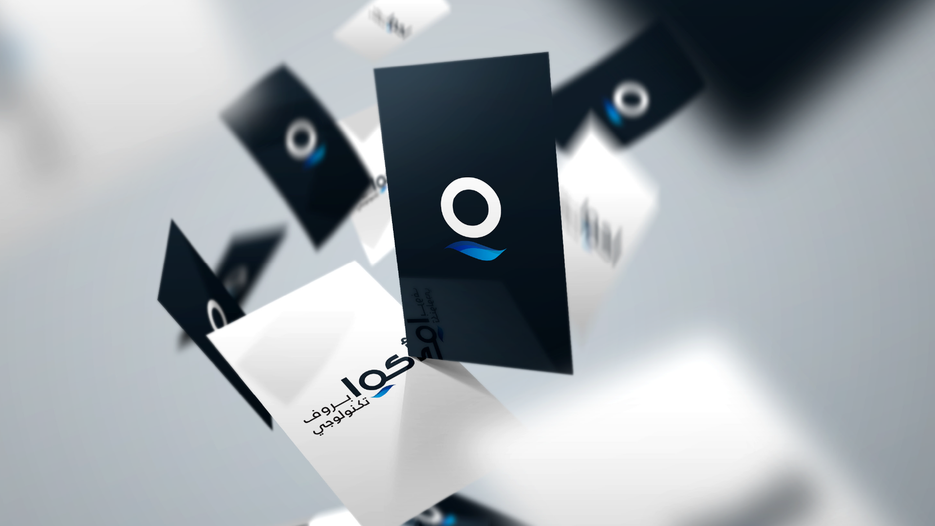
canar
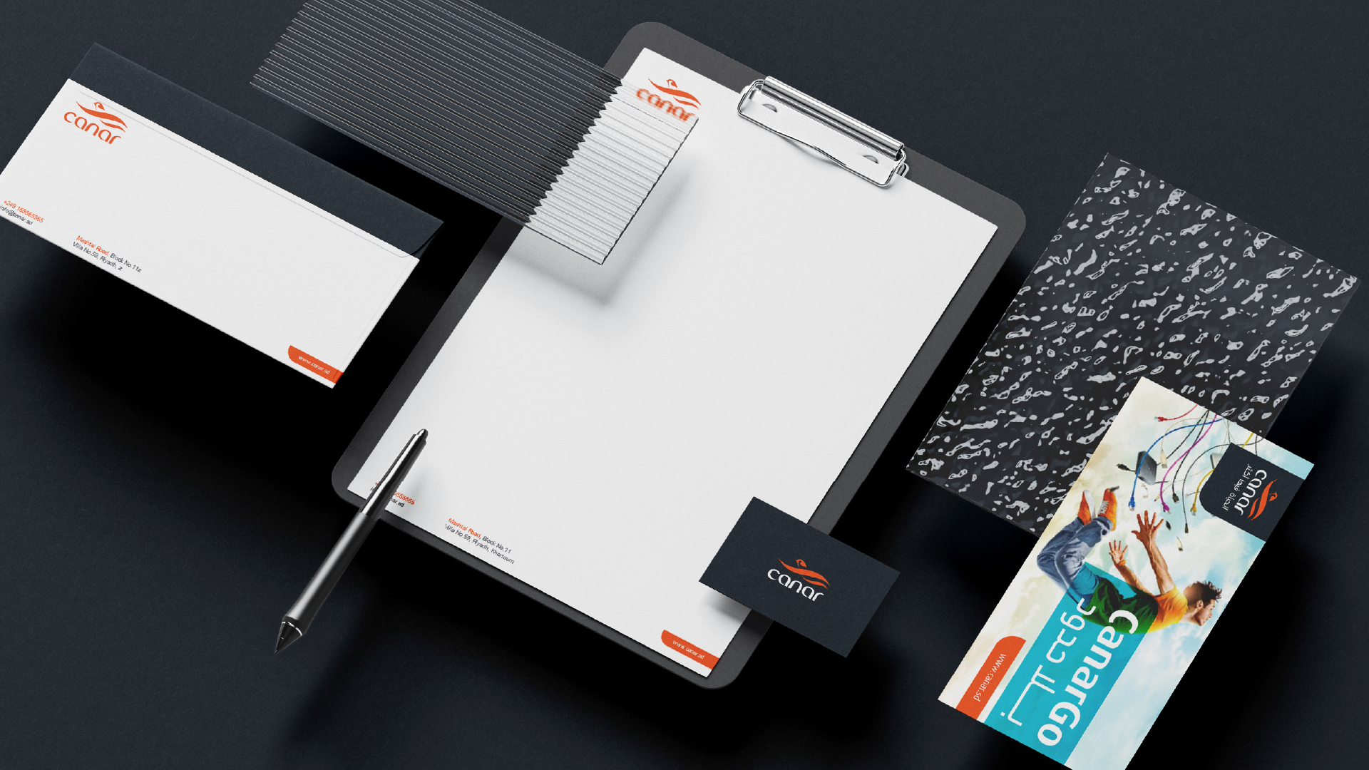
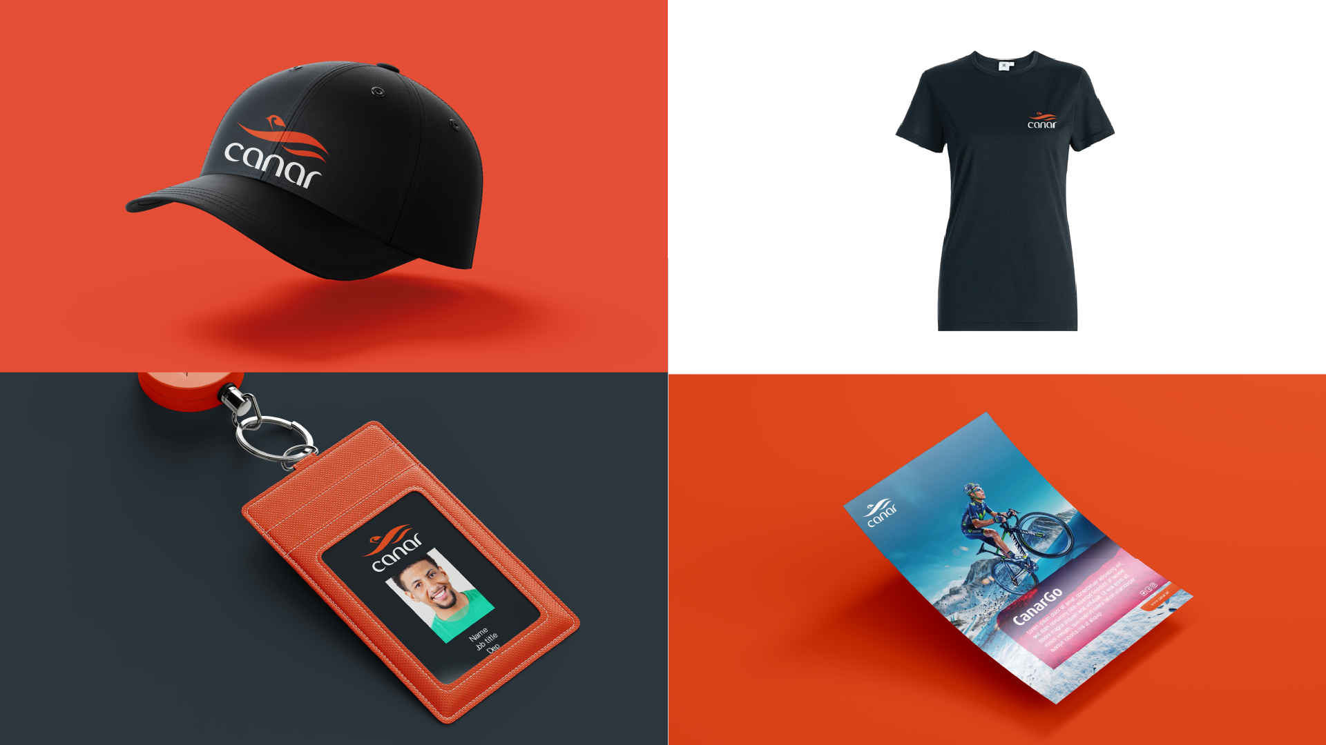
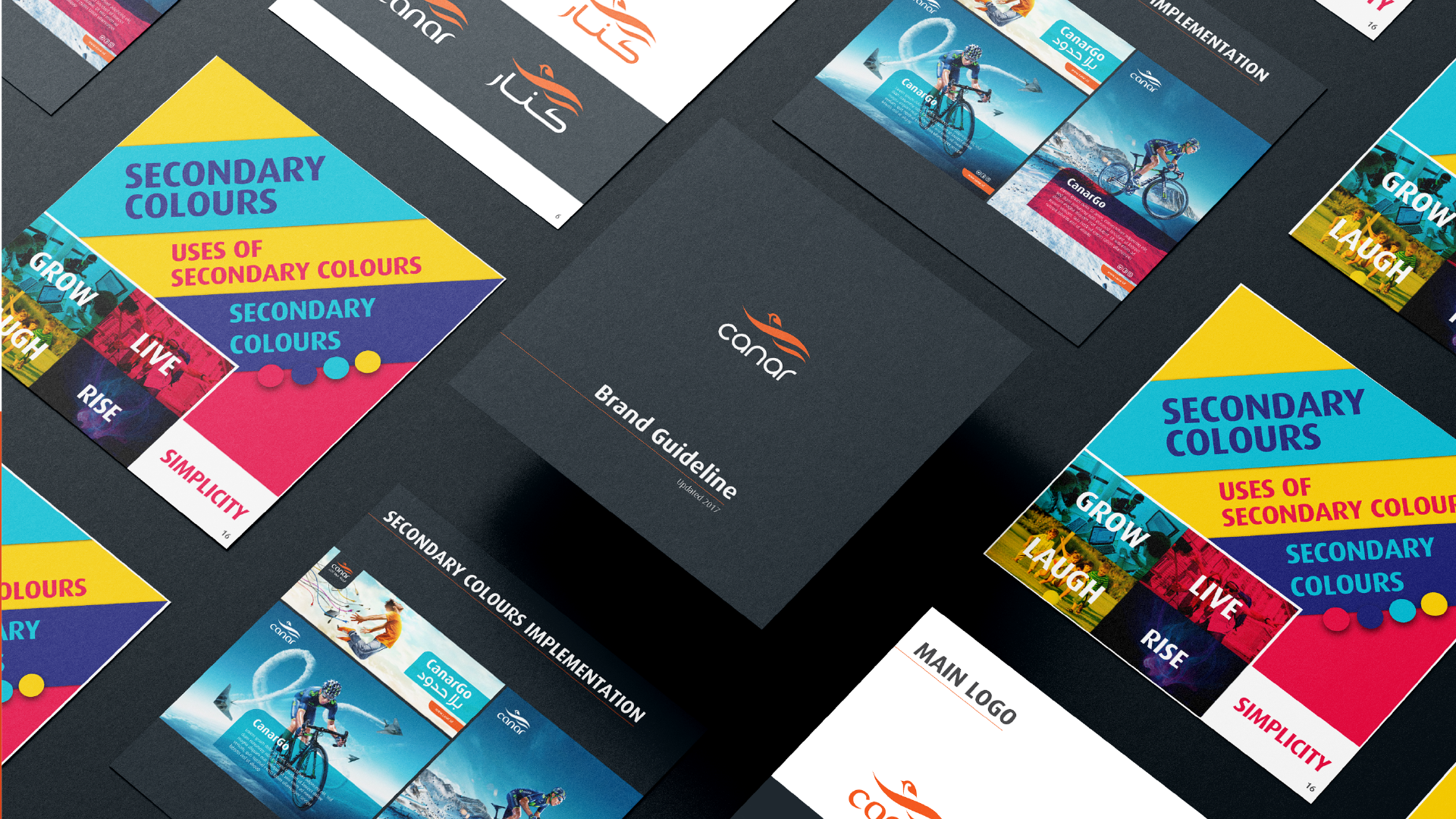
As we always try to understand our client’s mentality and motivate them to speak out more of what helps us bring something creative to reality, we found out that Canar had the problem of an outdated identity,
they needed an innovative brand look! Although their main aim was introducing a new logo, we were able to turn it into a task that would create a more modern look that would be reflective to their mission as a telecommunication company!
Both the colors of the logo and the font were old-fashioned and don’t reflect the current identity of the company, we modified the font so that it matches the natural flow of the image of Canar, modifying the color of the text to white instead of blue and the color of the logo was amended to look more saturated and bold!
This task might look slight but it made a huge influence on the interaction between the company and their customers, giving us another achievement to be proud of!
