Tirhal


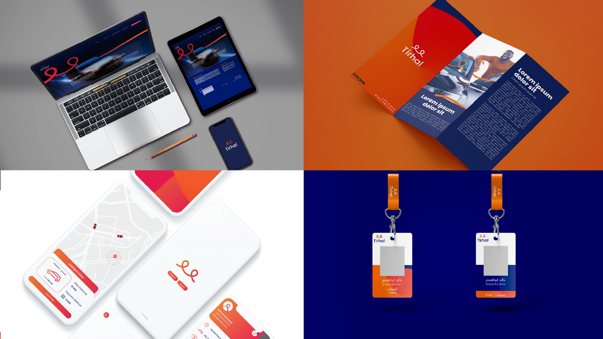
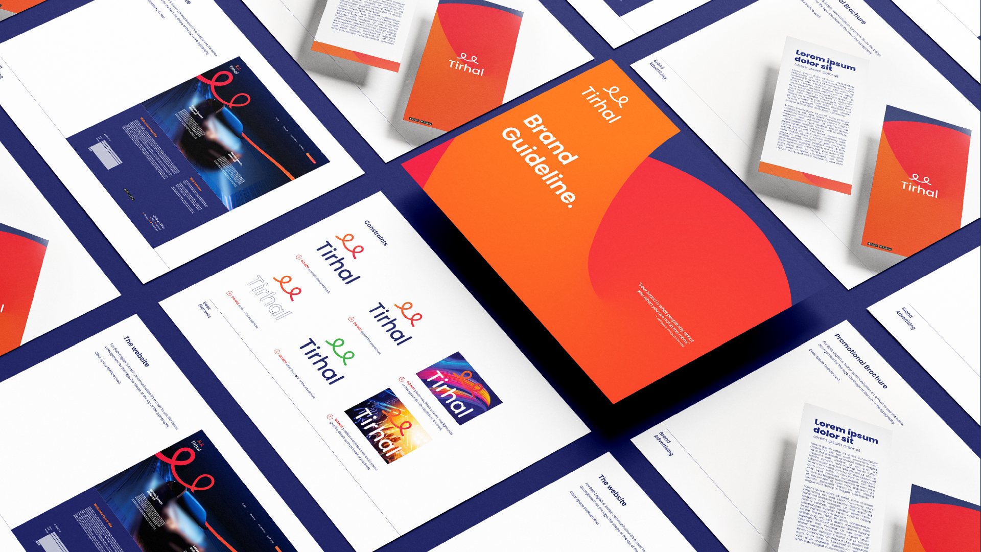
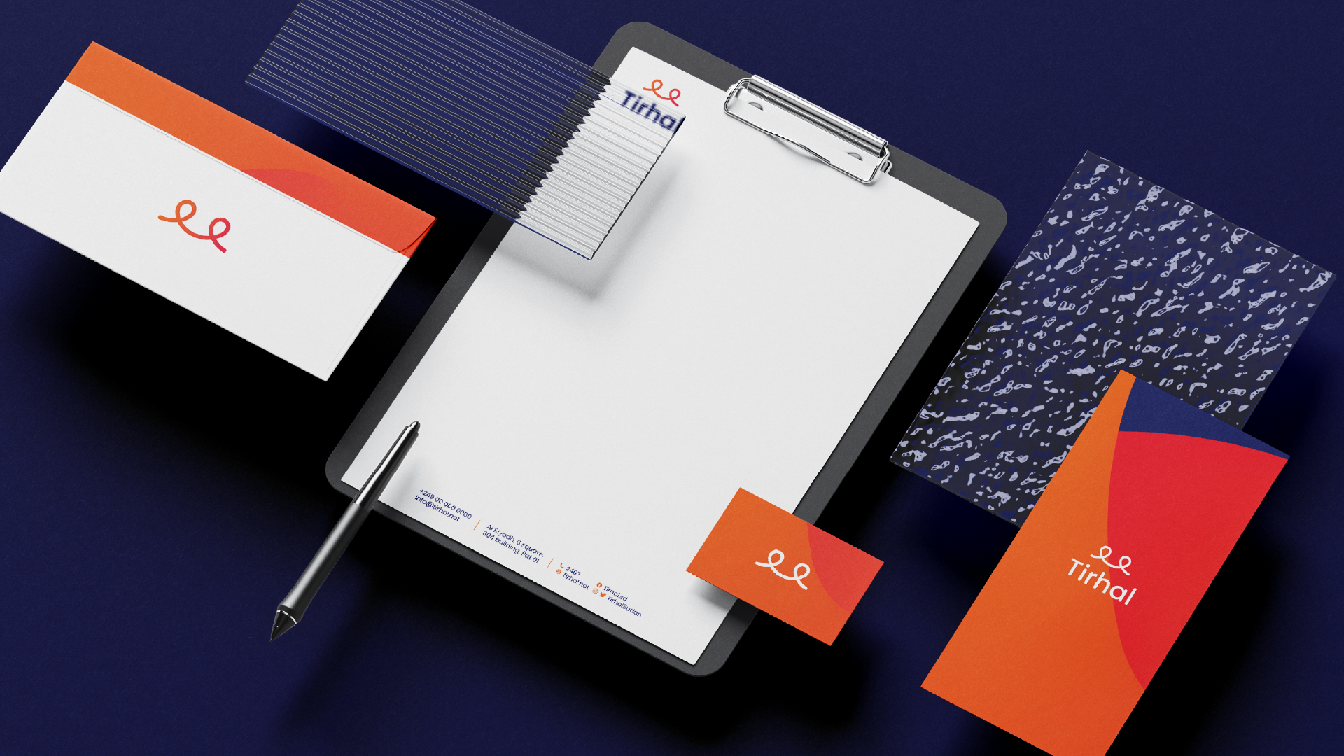
This logo defines Tirhal in a very simple yet smart manner.
The shape created here represents Tirhal’s services as well as values. There are two pin points on each side of the shape which show the journey from one destination to the other and simultaneously that can also be interpreted by the start and finish of the logo.
In addition to that, the shape represents the letter T in Arabic which stands for Tirhal. Lastly, it also represents a smile which gives the consumer a sense of security and joy to know that he/she is in safe hands and will enjoy the ride.

